Most trading journals show you a list of trades. A calendar trading journal shows you something different: your performance mapped to time. Green days, red days, streaks, patterns - all visible at a glance.
This sounds simple, but it reveals things that a trade log never will. A list of trades tells you which individual trades won or lost. A calendar tells you when you trade well and when you do not.
What a Calendar View Shows You
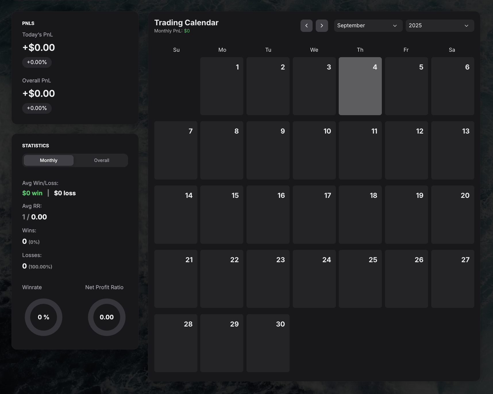
A calendar trading journal displays your daily P&L as a color-coded grid. Each day is a cell - green for profitable, red for losing, neutral for no trades. The shade intensity usually reflects the size of the gain or loss.
This layout immediately answers questions that matter for day traders and swing traders:
When are your best and worst days? Many traders perform better on certain days of the week. Tuesdays through Thursdays often show stronger results because volume is higher and setups are cleaner. Mondays can be erratic (weekend gap reactions), and Fridays can be thin (early closes, weekend positioning).
How long do losing streaks last? A calendar makes streaks visual. Three red days in a row is normal. Seven is a sign something is wrong with your process, not just bad luck.
Are you consistent or streaky? A steady pattern of green days with occasional small reds is very different from alternating big greens and big reds. The first pattern suggests a reliable edge. The second suggests gambling.
How does your month look compared to last month? Monthly summaries at the bottom of each calendar row give you a trend line without needing to calculate anything.
What a Calendar Reveals That a Spreadsheet Does Not
Spreadsheets can technically track daily P&L. But the visual difference between a row of numbers and a color-coded calendar grid is massive.
Consider two traders with identical monthly P&L of +$2,000:
- Trader A: small consistent greens most days, two moderate red days
- Trader B: many small reds, three enormous green days
On a spreadsheet, they look the same. On a calendar, the patterns are completely different, and the implications for risk management and strategy are different too.
Trader A has a consistent edge. Trader B is relying on outliers. One of these approaches is sustainable. The other is fragile.
How to Use Calendar Review in Practice
Daily (30 seconds)
After your last trade, glance at today's cell. Green or red? How does it compare to yesterday? That is all you need at the end of the day.
Weekly (10 minutes)
Look at the past five trading days. Count green vs red. Check if you had a streak in either direction. If you had three or more red days, ask: was it the market, or was it me?
Monthly (30 minutes)
Compare this month's calendar to last month's. More green days or fewer? Larger greens or smaller? Any weeks where you clearly should have taken a break? Note which week was best and why.
Seasonal patterns (quarterly)
Over several months, some traders discover they trade better in certain market conditions (trending vs choppy) or certain seasons. A calendar view across months makes this obvious.
Common Patterns to Watch For
Monday losses. If your Mondays are consistently red, consider whether you are forcing trades at the start of the week instead of waiting for setups to develop.
Friday blowups. End-of-week overtrading, often driven by wanting to "end the week green." If Fridays are your worst day, consider stopping at noon.
Post-loss streaks. A red day followed by three more red days often signals revenge trading. The calendar makes this visible before it becomes a habit.
Declining performance through the month. If weeks 1 and 2 are green but weeks 3 and 4 are red, you might be burning out, increasing risk, or getting complacent after early success.
Calendar View in Your Journal
GASPNTRADER includes a built-in calendar view that updates automatically as you log trades. Each day shows your total P&L, and you can click any day to see the individual trades behind it.
The monthly summary at the top gives you your total P&L, number of trades, win rate, and best/worst days for the month - all without any setup or formulas.
For a broader view of what a trading dashboard should track, see how the performance radar works.